Alice Charity

breathing new life into a fantastic local service

Making the Shift

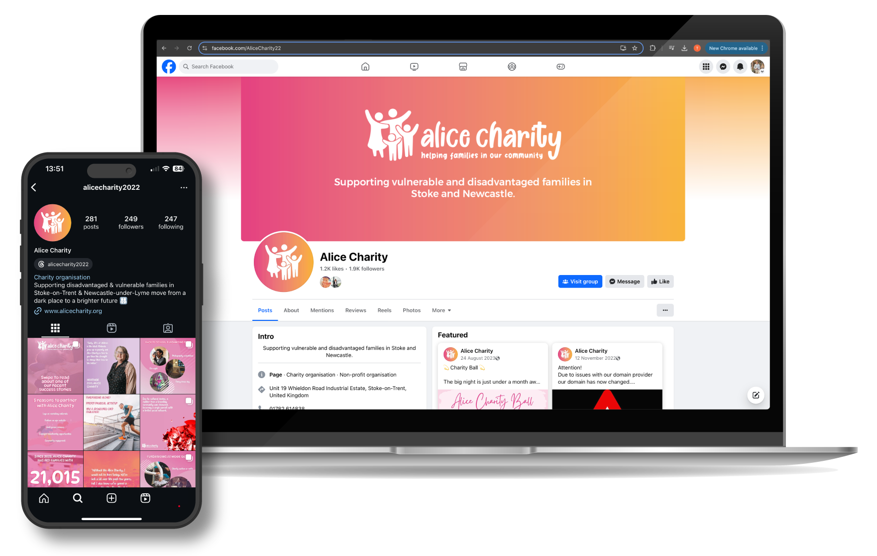
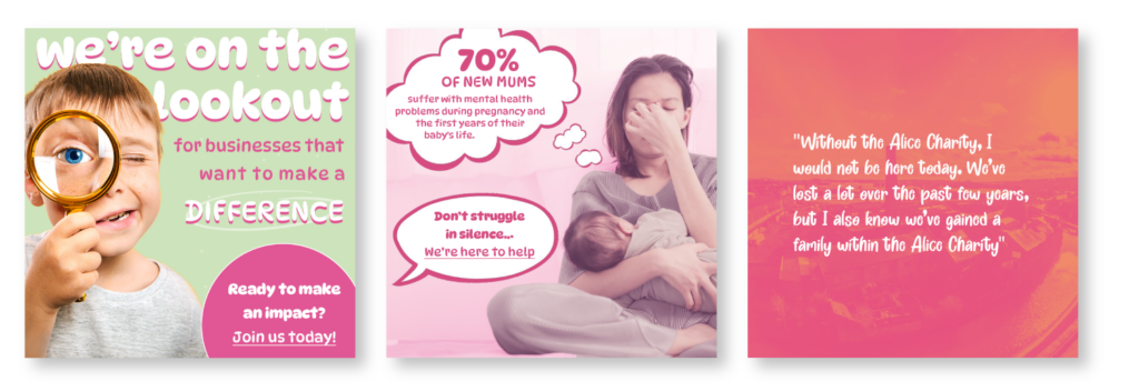
Shifting away from Pink was our main objective for the rebrand, switching the female orientation to a more inclusive approach, incorporating a wider colour palette. In terms of functionality, the original logo didn’t work as a monochromatic, meaning the design wouldn’t be fully visible on a black background, for example. The new logo can be placed on any background and asset with full readability, which was one of the main objectives.
Logo Rebrand

Orange is the New Logo

We wanted to design a logo to identify Big Cup as a standalone sub-brand within Alice Charity, giving it its own unique logo which represents the values of this service. As a colour, orange represent happiness, optimism, and warmth – all keeping in the themes of Big Cup in its want to create a new network of parents that need a support network to overcome isolation and financial distress. The hand around the cup represents this support, with the orange also linking to the main Alice Charity logo, ensuring that the brand identity is strung throughout all elements of the brand.

Big-Cup

Quality Time

The logo for the People’s Pantry was created to portray the feeling of care and nurture, replicated in the supporting hands. Colour choices for this were pulled form the parent logo, which was made again to be monochromatic. As is the case for all the sub-branding, we wanted there to be a clear segmentation and identifiable qualities as to aid with the Facebook groups for each service and event planning

Fleshing out the Brand

We carried out a document audit to find all the areas needing new asset creation. A fundraising pack, posters, and a cookbook were created, fleshing out the branding across all to ensure that there was continuity throughout, from the logos and font to the colour palette and content. This was to keep everything created in line with the website and the new brand guidelines.

Read All About It

Our new management of the social media channels was carried out in order to maintain consistency, matching content which could then be found on the website and at any events or groups that people were to attend. Our main aim was to highlight the benefits of CSR – how businesses get benefits for supporting charities. We wanted to show how companies choosing to partner and support Alice Charity could both be seen by their own online community in a more giving and positive light, but also to make them aware of what benefits they would then receive. Some content we created includes case studies, reviews, and statistics from across all services. In terms of visuals, our goal was to create aesthetically pleasing content which was engaging and identifiable for both B2B and B2B audiences.

need some marketing wisdom?

we're all ears and ready to chat.

When you’re ready for us to take the reins,
we’ll lead you to success.