Why Are Big Brands Ditching Their Iconic Logos?
In 2024, it’s clear that big brands are rethinking their marketing strategy. It’s a wave of ‘back-to-basics’ redesigns, tapping into the power of nostalgia while adapting to modern tastes. From KitKat’s sleek new lines to GAP’s infamous logo U-turn, let’s dive into the bold trend of brands rediscovering their simpler selves.

Pepsi
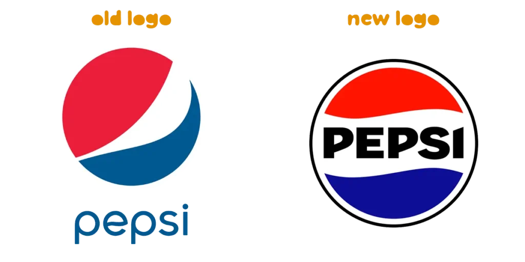
Pepsi’s new logo is a blast from the past of the 90s, reintroducing the uppercase ‘PEPSI’ inside the circle of red, white, and blue. We last saw this logo between 1987 and 1997, before the brand hit refresh and later opted for the lowercase ‘pepsi’ between 2008 and 2022. It now adds a pop of electric blue outside the logo design, which is said to offer a ‘contemporary edge’, and the black background being used to signify the growth of the zero sugar ‘Pepsi Max’. This was originally rolled out primarily in the US in 2023 but saw the launch globally this year.

Lamborghini
Lamborghini, like other car brands such as BMW, KIA, and Rolls Royce, recently opted to strip back their logo. Going for a more minimalistic approach, this luxury car brand lost the touches of black and gold, using a simplistic black and white design instead.

PayPal
PayPal marked its 25th anniversary by going it back to basics, removing the classic multi-tonal blue and iconic double ‘P’, choosing an all-black text instead. This came at a time that PayPal used a feature from Will Ferrell in a promotion for the new PayPal debit card.

KitKat
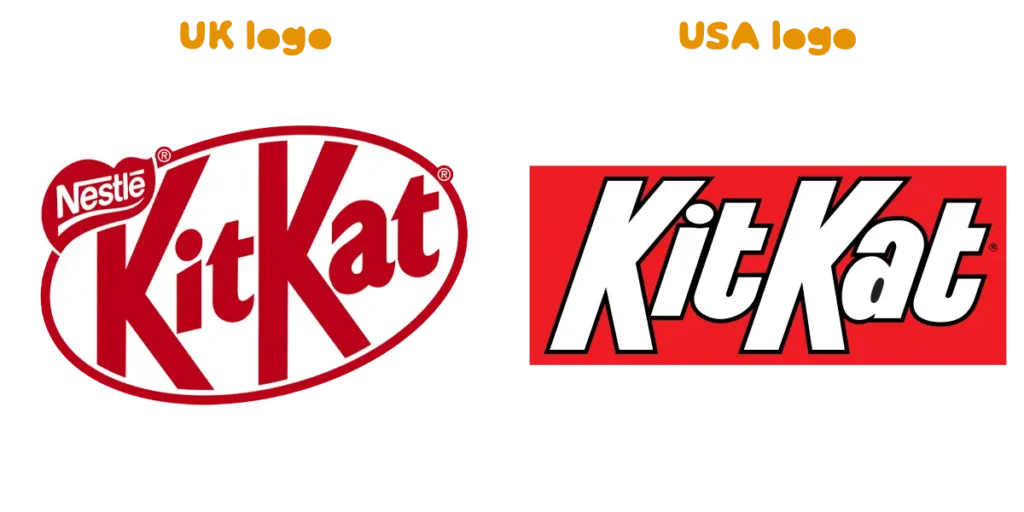
KitKat’s new logo design is clean and bold, featuring sharper lines and removing the curves from the ‘t’ and ‘a’. The white ring around the text is now thinner, with the letters positioned closer together. Interestingly, the UK and US versions differ slightly – British packaging shows the text slanting left, while in the States it tilts to the right.

GAP
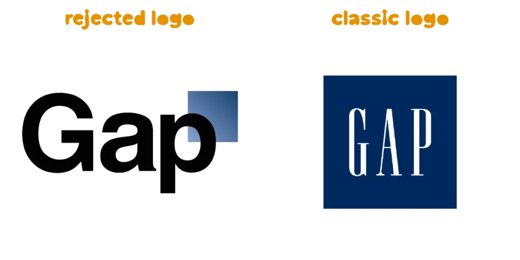
GAP is known for having an infamous logo change in that it backfired massively, leading to 6 days of backlash before returning to the much-loved design created 1990. This blue-square visual is a recognisable one, but GAP decided to make the switch after a slump in sales following the Financial Crisis in 2008. Vice President of Communications, Bill Chandler, spoke on the change as ‘contemporary, modern expression’, which was later criticised to be a panic move to counter the fall in sales and brand fatigue.
Power in Brand Recognition
So, why does this matter? Honestly, it doesn’t. People might get all worked up about logo changes, but the real strength of a brand lies in its actions. When you think of Nike, it’s not just the ‘swoosh’ that comes to mind. It’s the stylish trainers, the epic ads, and the collaborations with icons like Ronaldo or Mbappe.
Logo redesigns hit the mark when the brand already has a solid product behind it. Like with KitKat, the logo might have sharper lines and a slimmer circle, but the beloved chocolate wafer inside hasn’t changed a bit.
At Swift, we know a sleek logo is just the beginning – it’s the entire brand experience that matters. Our branding packages and promotion plans do more than make a good first impression; they’re built to drive unforgettable marketing campaigns that keep people talking about everything you stand for, not just your logo.
Want to chat some more over a coffee? Chat to us today.
